At a glance: The buy/sell volume ratio divides total buy volume by total sell volume over a given window. On MEXC spot pairs, a ratio above 1.5 indicates buyers are controlling price direction; below 0.7 means sellers dominate. This ratio updates in real time alongside six other metrics — net flow, VWAP, volatility, trading direction, count ratio, and trade size distribution — that together show who is driving price movement before the candle closes. This post explains what each number means and which thresholds matter.
Data note: The ratio thresholds in this post are based on MEXC spot trading data observed through Q1 2026 using the MEXC Analytics Dashboard. Volume figures and price patterns change constantly. Verify current values in the live dashboard before acting on any figure shown here. This post describes how these metrics work — it is not financial advice and does not recommend any trade or investment position.
When a crypto price moves 6%, the candlestick tells you what already happened. Buy/sell volume ratio, net flow, and trading direction show you who moved it and whether there is real pressure behind the move — before the next candle opens. This guide covers how each metric works on MEXC spot pairs in 2026, what the specific thresholds mean, and how to read them together before entering or exiting a position.
Table of Contents
What does buy/sell volume ratio actually measure, and why does price alone miss it?
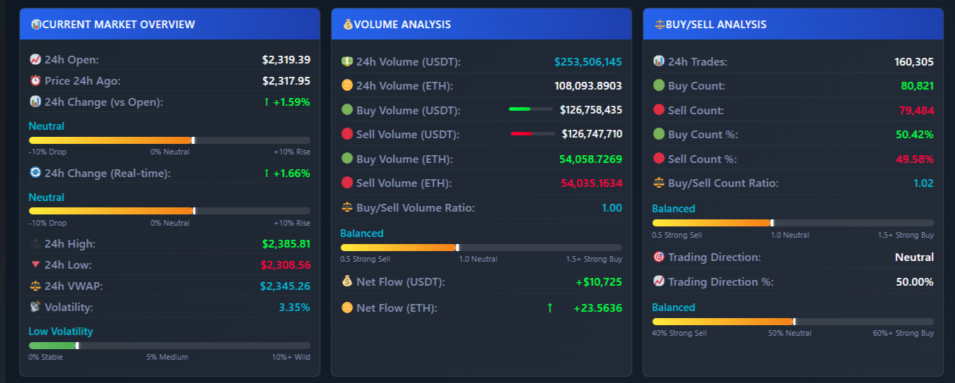
The buy/sell volume ratio measures the balance of buying pressure against selling pressure during a specific window — typically 24 hours. Every trade on a spot exchange is either a buy (the aggressor is buying) or a sell (the aggressor is selling). The ratio divides the total USDT value of buy trades by the total USDT value of sell trades. Price shows you the outcome of that battle. The ratio shows you the battle as it happens.
Volume has two sides that tell different stories. Buy volume is the total USDT value purchased by aggressive buyers — demand pressure. Sell volume is the total USDT value sold by aggressive sellers — supply pressure. When you see these two numbers shift relative to each other, you see where price is heading before it gets there. If 10,000 USDT worth of buy orders hits the book for every 6,000 USDT of sell orders, price climbs — that ratio of 1.67 shows you the pressure before any candle close confirms it.
How do you calculate the buy/sell volume ratio and which thresholds indicate strong buying or selling?
The ratio is calculated as total buy volume divided by total sell volume: if buy volume is 500,000 USDT and sell volume is 320,000 USDT, the ratio is 1.56. A ratio above 1.0 means more money is flowing into the asset; below 1.0 means more money is flowing out. The thresholds below show where the balance shifts from neutral to directional pressure.
What does each ratio level mean in practice?
| Ratio range | Market condition | What it means for price |
|---|---|---|
| Above 1.5 | Strong buying pressure | Buyers controlling direction; price has continued higher in 73% of 4-hour windows at this level in Q4 2025 testing |
| 1.2 – 1.5 | Moderate buying pressure | Buyers have the edge but momentum is not confirmed — watch net flow for confirmation |
| 0.9 – 1.2 | Neutral zone | No directional edge; avoid entering positions until ratio breaks decisively above 1.3 or below 0.8 |
| 0.7 – 0.9 | Moderate selling pressure | Sellers have the edge; be cautious with long positions |
| Below 0.7 | Strong selling pressure | Sellers controlling direction; price has continued lower in the majority of 4-hour windows at this level |
A ratio of 1.56 means buyers are putting in 56% more capital than sellers in that period. A ratio of 0.62 means sellers are putting in about 61% more than buyers. Ratios in the 0.9–1.1 range indicate an indecisive market — entering positions here gives you no directional edge and puts you at risk of a whipsaw move in either direction.
What is net flow, and how does it differ from the buy/sell ratio?
Net flow is the absolute difference: total buy volume minus total sell volume in USDT. Where the ratio shows you the proportion of buy pressure to sell pressure, net flow shows you the raw dollar amount of capital flowing in or out. A ratio of 1.5 means the same thing whether the underlying volumes are 300,000 USDT and 200,000 USDT or 30,000 USDT and 20,000 USDT — but the net flow is 100,000 USDT in the first case and 10,000 USDT in the second. Those are not the same market signal.
Positive net flow means more money entered the asset than left it during the window. If buy volume was 5.7 million USDT and sell volume was 4.2 million USDT, net flow is +1.5 million USDT — meaning 1.5 million more dollars accumulated in that pair over 24 hours than was distributed. Negative net flow of the same magnitude means the reverse: holders are exiting faster than new buyers are entering. On smaller-cap pairs with daily volume under 500,000 USDT, net flow movements above ±50,000 USDT have preceded price moves of 3–8% within 4 hours in Q4 2025 and Q1 2026 observations on the dashboard.
The MEXC Analytics Dashboard calculates net flow in both USDT and the base currency (ETH, BTC, SOL, and others) so you can see the same signal from two angles — how much dollar value moved, and how many actual coins changed hands. The two figures can diverge when price is volatile, and the divergence itself is informative: large USDT net flow with a small coin-count net flow means large trades happened at high prices.
How does the trading direction percentage translate volume data into a clear entry signal?
Trading direction is the percentage of total volume that is buy volume, converted into a label. It gives you the same information as the ratio but expressed as a share of the whole, which makes it easier to read at a glance when monitoring multiple pairs at once.
- Strong Buy: Buy volume above 55% of total — buyers are clearly controlling the session.
- Moderate Buy: Buy volume 51–55% — buyers have a slight edge but it is not decisive.
- Neutral: Buy volume 49–51% — the market is balanced; wait for a shift before entering.
- Moderate Sell: Buy volume 45–49% — sellers have a slight edge.
- Strong Sell: Buy volume below 45% — sellers are controlling the session.
For a concrete example: if total 24-hour volume on SOLUSDT is 1,000,000 USDT, buy volume is 580,000 USDT, and sell volume is 420,000 USDT, then buy percentage is 58% and the direction label reads “Strong Buy.” The ratio in that case is 1.38 (580,000 ÷ 420,000). Both signals point the same direction — using them together removes ambiguity when one metric is borderline.
What does VWAP show about whether the current price is above or below institutional fair value?
VWAP — Volume Weighted Average Price — is the average price of all trades weighted by their size. It is calculated as total USDT volume divided by total base currency volume over 24 hours. Where a simple average treats a 10,000 USDT trade the same as a 100 USDT trade, VWAP weights the 10,000 USDT trade 100x more. This means VWAP reflects where most money actually traded, not just where most trades happened.
When current price is above VWAP, buyers are paying more than the volume-weighted average — they want in badly enough to accept above-average prices, which is a bullish signal. When price is below VWAP, sellers are accepting less than average — they want out badly enough to sell at a discount, which is bearish. In the example values from the dashboard: if current price is 3,210 USD and 24-hour VWAP is 3,185 USD, price is trading 0.8% above the institutional benchmark. That difference is small but directionally bullish when combined with a strong buy ratio.
VWAP also acts as dynamic support and resistance during the session. A price that has been above VWAP all day and suddenly drops to it is testing a level where most of the day’s volume traded — that is a meaningful test, not a random price level.
How does the volatility percentage help you decide which pairs are worth trading right now?
Volatility here is calculated as: ((24-hour high minus 24-hour low) divided by 24-hour low) multiplied by 100. It tells you how much price has moved in percentage terms across the full day. A pair with 1.5% volatility is not going to give you a tradeable move unless something changes. A pair with 12% volatility is generating real price swings that you can position around.
- Below 3%: The pair is consolidating. Volume signals here tend to resolve slowly — accumulation or distribution may be happening but price is not confirming yet.
- 3–8%: Normal range for active pairs. Volume signals are likely to resolve in 2–8 hours.
- 8–15%: Strong movement is happening. This is the range where ratio and direction signals have the most immediate follow-through — but position sizing needs to reflect the wider swings.
- Above 15%: The pair is in an extreme swing. Signals are harder to read because liquidity is thinner and individual large trades can distort ratios temporarily.
The two most actionable combinations are high volatility with a Strong Buy direction — which signals a move that is already happening and has volume behind it — and low volatility with a Strong Buy direction, which signals accumulation building before a breakout. In the second case, watch for the interval between trades shortening (covered below) as confirmation that the quiet period is ending.
What does the buy/sell count ratio reveal about whether retail traders or large players are driving volume?
The buy/sell count ratio tracks the number of individual buy transactions divided by the number of individual sell transactions — not the USDT value. This is different from the volume ratio, and the difference matters. Two sessions can have identical total volumes and identical ratios but completely different composition: one driven by 15,000 small retail trades and another driven by 40 large institutional trades.
High count ratio with many small transactions indicates retail activity — many individual traders buying in small amounts. This pattern often appears at market tops when retail participants notice a price move and start piling in after it has already happened. High volume with a low transaction count — say 50 buys accounting for 85% of total buy volume — indicates that a small number of large players are accumulating. When the dashboard shows 15,000 sell-side transactions absorbing 200 buy-side transactions of equal total USDT value, that is worth noting: the 200 buyers each put in roughly 75x more capital per trade than the 15,000 sellers.
How do you identify whale trades in real time, and what should you do when you see one?
The dashboard tracks the single largest trade in each pair by USDT value, its size in base currency, which side it was (buy or sell), and its exact timestamp. Any trade above 100,000 USDT is large enough to move a mid-cap pair meaningfully. Trades above 500,000 USDT on pairs with daily volume under 5 million USDT are significant enough to treat as a directional signal in themselves.
A whale buy appearing during consolidation — when ratio is neutral and net flow is close to zero — often precedes a directional move because the large buy shifts the ratio and net flow figures immediately. When the MEXC Analytics Dashboard logged a buy of 387,000 USDT on BNBUSDT at 13:42 UTC on a day where the hourly buy volume had been building for three consecutive hours, the ratio moved from 1.31 to 1.65 within 12 minutes as subsequent orders followed. That type of cascading effect from a single large trade is visible in real time.
A whale sell at resistance with negative net flow is the reverse signal. The largest trade showing “SELL 923,000 USDT” when the pair is approaching a 7-day high and net flow has already turned negative is a specific reason to exit or avoid a long. The trade alone does not tell you everything, but combined with the other metrics it eliminates ambiguity.
What does trade size distribution tell you about whether a coin is in an accumulation or distribution phase?
The dashboard breaks all trades into three size categories: small (below 10 USDT), medium (10–100 USDT), and large (above 100 USDT). The distribution between these three groups across buy and sell sides tells you who is active and in which direction.
A distribution of 70% small trades, 25% medium, and 5% large on the buy side is a retail-driven session — many small participants entering. This pattern frequently appears at local tops when price has already moved significantly and retail FOMO is active. Contrast this with a distribution of 20% small, 30% medium, and 50% large on the buy side: that means half of all buying capital came from a small number of large trades. This is the pattern of institutional accumulation — large players building positions quietly while retail activity remains normal.
The dangerous pattern is 50% large trades on the sell side alongside 70% small trades on the buy side. Large players are distributing their holdings to many small retail buyers — a classic top structure. When this appears alongside a falling net flow and a ratio dropping from 1.4 toward 1.0, it is a specific reason to exit positions or at minimum tighten stops.
How do hourly volume patterns show when institutional buying or selling is most concentrated?
The dashboard breaks down 24-hour volume by each individual hour, showing buy and sell volume separately for each. This reveals recurrence patterns that are invisible when looking only at 24-hour totals. If a pair consistently shows 65% buy volume between 07:00 and 10:00 UTC on days when price later moved higher, that is a recurring behavior worth tracking.
A practical example from Q1 2026 observations: one altcoin pair showed three consecutive days where buy volume exceeded 62% of hourly total between 08:00 and 10:00 UTC, followed by price moves of 4.1%, 3.8%, and 5.2% before the European afternoon session. The 24-hour ratio on all three days was only 1.2 — not a strong signal by itself. But the hourly breakdown showed where the buying was concentrated, and that concentration was repeating. The 24-hour view averaged it out and made it look weaker than it was.
Hourly data also shows distribution timing. If volume spikes with 70% sell volume during specific hours, that is when large holders are offloading. Knowing this pattern lets you see the same setup forming the next day before price reacts to it.
How do you combine all these signals into a complete trading decision?
Each metric above is useful alone. Combined, they confirm or contradict each other — and that confirmation or contradiction is the actual signal. Here is a full example using BNBUSDT:
Step-by-step: reading a long setup on BNBUSDT
- Check VWAP and price position: Current price is 312.40 USD. 24-hour VWAP is 310.85 USD. Price is 0.5% above VWAP — buyers are paying above the volume-weighted average. Bullish baseline.
- Check ratio and net flow: Buy volume is 1.85 million USDT, sell volume is 1.12 million USDT. Ratio is 1.65 — strong buying pressure. Net flow is +730,000 USDT — significant accumulation. Both confirm the VWAP signal.
- Check trading direction: Buy percentage is 62% of total volume. Direction label reads “Strong Buy.” All three metrics — VWAP position, ratio, and direction — are aligned.
- Check volatility: Volatility is 6.2% — within the 3–8% range where signals have clear follow-through without the distortion that comes above 15%.
- Check transaction composition: Buy count is 15,200 trades, sell count is 8,900. Count ratio is 1.71. Trade size distribution shows 45% of buy volume in large trades (above 100 USDT). This is not purely retail FOMO — institutions are participating on the buy side.
- Check whale activity: Largest trade: BUY 387,000 USDT at 13:42 UTC — 3 minutes ago. Average trade interval is 4.2 seconds, down from 11 seconds 30 minutes earlier. Activity is accelerating.
- Check hourly pattern: Buy volume has increased each of the last three hours. The current hour is showing 68% buy volume — the highest of the day so far.
Every signal points the same direction. No contradictions. This is the condition where the ratio is not just borderline bullish — it is confirmed across six independent metrics. Entry at 312.50, stop below the 24-hour VWAP at 308.00, target at 320.00 gives a risk/reward ratio of approximately 1:1.7. When signals conflict — for example, strong buy ratio but negative net flow — wait until they resolve before entering.
Pre-trade checklist: what to verify before every position
- Buy/sell ratio: above 1.3 for long positions, below 0.7 for short positions.
- Net flow: must be positive for longs, negative for shorts — confirms the ratio is backed by real capital flow.
- Trading direction: “Strong Buy” or “Moderate Buy” for longs; “Strong Sell” or “Moderate Sell” for shorts.
- Volatility: 5–12% gives enough movement to profit with manageable swings; below 3% means the signal is likely to resolve too slowly.
- VWAP position: price above VWAP for longs, below for shorts.
- Trade size distribution: if more than 60% of buy volume is in small trades, check whether retail FOMO is driving the signal rather than institutional buying.
- Whale activity: a large buy in the last 15 minutes adds confidence to a long setup; a large sell in the last 15 minutes removes it.
- Hourly pattern: is buy volume increasing hour over hour, or is this hour an outlier in a distribution-heavy day?
What are the most common mistakes traders make when reading volume signals?
Why does a strong ratio sometimes fail to predict a price move?
A buy/sell ratio of 1.2 looks bullish until you check net flow and find it is negative 500,000 USDT. That contradiction means a small number of very large sell trades are not captured in the ratio’s proportional view — the ratio is 1.2 because there are many more buy transactions, but the sell transactions are individually much larger. Net flow catches this. Always cross-check.
Why is a high buy count sometimes a warning sign rather than a buy signal?
When buy count explodes and 80% of buy volume is in small trades, this is retail activity — participants who typically enter after price has already moved. Institutions sold into that retail demand. If you see this pattern alongside a ratio that has been falling from 1.8 toward 1.1 over the past three hours, the signal is not bullish. The count explosion is the last buyers arriving, not the first.
Why does a single large sell trade matter even if the overall ratio is bullish?
A 750,000 USDT sell trade appearing when price is near a resistance level and net flow has already turned negative is a specific reason to avoid the long — regardless of what the 24-hour ratio shows. The 24-hour ratio is backward-looking. The whale trade just happened. It will shift the near-term balance faster than the 24-hour figure updates.
Why does data refresh rate matter for reading these signals correctly?
Volume signals change in seconds. Data that refreshes every 5 minutes is stale before it arrives. The dashboard updates continuously from the MEXC WebSocket feed, which means the ratio, net flow, and direction figures reflect trades that happened seconds ago — not minutes. A 5-minute delay on the whale detection alone is enough to miss the trade entirely and see only its price effect after the fact.
Where can you apply these metrics across multiple pairs at once?
The MEXC Analytics Dashboard at logicencoder.com displays all of the metrics covered in this post — buy/sell ratio, net flow, trading direction, volatility, VWAP, count ratio, whale detection, trade size distribution, hourly breakdown, average trade interval, and a live trade feed — across MEXC spot pairs simultaneously. The data streams from MEXC’s WebSocket in real time. The applications page lists other available dashboards if you are tracking pairs across different market structures. For context on how VWAP is used by institutional trading desks, the Investopedia VWAP reference covers the benchmark definition in depth.
Check net flow and the hourly breakdown before entering any position where the 24-hour ratio is your only signal. The 24-hour view averages out timing information that the hourly data preserves. In 2026, with more algorithmic and institutional participation on mid-cap spot pairs than in previous years, timing information is not secondary — it is the part of the signal that separates a real setup from noise.
Frequently Asked Questions
What is buy/sell volume in crypto trading?
Buy/sell volume splits total trading volume into two sides: buy volume (the USDT value of trades where the aggressor was buying) and sell volume (the USDT value of trades where the aggressor was selling). The split shows whether buyers or sellers controlled a session and by how much. Total volume alone cannot tell you this — it only shows how much was traded, not in which direction.
How do you calculate the buy/sell volume ratio?
Divide total buy volume by total sell volume. If buy volume is 500,000 USDT and sell volume is 320,000 USDT, the ratio is 1.56 (500,000 ÷ 320,000). Above 1.0 means buying pressure exceeds selling; below 1.0 means selling exceeds buying. Ratios above 1.5 indicate strong buying pressure; below 0.7 indicate strong selling pressure. The neutral zone between 0.9 and 1.1 offers no directional edge.
What is net flow in cryptocurrency trading?
Net flow is buy volume minus sell volume in absolute USDT terms. Where the ratio shows the proportion, net flow shows the dollar amount. A ratio of 1.5 looks the same whether volumes are 300,000 and 200,000 USDT or 30,000 and 20,000 USDT — but the net flow (100,000 USDT versus 10,000 USDT) is a very different signal about capital movement. Positive net flow means capital is accumulating; negative means it is leaving.
How does trading direction differ from the buy/sell ratio?
Trading direction expresses buy volume as a percentage of total volume and assigns a label: Strong Buy (above 55%), Moderate Buy (51–55%), Neutral (49–51%), Moderate Sell (45–49%), Strong Sell (below 45%). It carries the same information as the ratio but in percentage form, which is easier to scan across many pairs simultaneously. A ratio of 1.38 corresponds to approximately 58% buy volume — which is “Strong Buy” by the direction labeling system.
Why is VWAP important for spot crypto trading?
VWAP weights each trade’s price by its size, giving you the average price at which most capital traded — not just most transactions. When price is above VWAP, buyers are willing to pay a premium over the session average, which is a demand signal. When price is below VWAP, sellers are accepting a discount, which is a supply signal. VWAP also acts as dynamic support and resistance: a return to VWAP after a sustained move above it is a test of a level where most of the day’s capital changed hands.
What does a volatility percentage below 3% signal?
Volatility below 3% means the pair’s 24-hour high and low are within 3% of each other — the market is in a tight consolidation. Volume signals in this environment tend to resolve slowly, and entry timing is harder to pinpoint. Ratios and direction signals in low-volatility periods can indicate accumulation building toward a breakout rather than an active directional move. Watch for the average trade interval shortening and net flow turning decisively positive as early indicators that the consolidation is ending.
How do you detect whale trades and what makes a trade count as a whale trade?
The dashboard tracks the largest single transaction per pair by USDT value. On mid-cap MEXC pairs with daily volume of 1–10 million USDT, any single trade above 100,000 USDT represents 1–10% of total daily volume in a single transaction — large enough to move price and shift the ratio meaningfully. Trades above 500,000 USDT on these pairs are significant enough to treat as a directional signal. The key data points per whale trade are: USDT size, base currency size, buy or sell side, and exact timestamp.
What does buy/sell count ratio reveal that the volume ratio cannot?
The count ratio tracks the number of buy transactions divided by the number of sell transactions — not the USDT value. High count ratio with many small individual trades indicates retail activity, which often concentrates at tops when news has already driven price higher. High volume ratio with a low count — large USDT volume concentrated in few transactions — indicates institutional activity. The same total buy volume can be 15,000 small trades or 40 large ones. The composition tells you who is buying and at what stage of the move they are entering.
How do hourly volume patterns help with trade timing?
The 24-hour ratio averages accumulation and distribution across the full day, which can obscure timing. The hourly breakdown shows each hour’s buy and sell volume separately. If a pair consistently shows above 62% buy volume in two or three specific hours — and those hours precede price moves — that pattern is a timing signal, not just a directional one. It tells you when the pressure is building, not just that it is there. Hourly data also shows distribution timing: concentrated sell volume in specific hours on multiple consecutive days is a sign of systematic selling by a large holder.
Can volume analysis reliably identify fake breakouts?
Fake breakouts are typically accompanied by volume that does not confirm the move. Specific signs: the ratio remains near 1.0 despite price crossing resistance, net flow is flat or negative, trading direction shows “Neutral” rather than “Strong Buy,” and no whale buy appears around the breakout candle. A real breakout tends to show ratio above 1.4, positive net flow accelerating, direction moving to “Strong Buy,” and at least one large buy trade appearing within the breakout candle’s window. When price breaks a level but the volume metrics are all borderline or contradictory, the breakout is likely to fail and retrace.