The standard MEXC interface shows you a price chart and a basic order book. What it does not show you is whether the volume behind a price move came from one large trader or a thousand small ones, whether net capital flow is positive or negative right now, or what the buy/sell execution count actually looks like versus the volume ratio. This dashboard was built to fill that gap — a free, browser-based analytics layer on top of MEXC’s public data feed, covering 525+ active symbols in real time. No login, no installation. Open the live dashboard here.
For similar real-time monitoring tools for other chains, see the Dynex Large Transaction Monitor and the Wrapped Dynex Richlist (0xDNX) DHIP v2. Technical overviews of the dashboard components are on GitHub: frontend plugin overview and backend overview.
What the Standard MEXC Interface Does Not Tell You
When a coin on MEXC spikes 4% in 90 seconds, the price chart shows you the move. It does not tell you whether that move was driven by a single $1.2M market order or by 4,000 retail traders each putting in $50. Those two scenarios have completely different implications for whether the move will hold or reverse. The standard interface also resets trade history quickly and gives you no way to export raw tick data for analysis.
Three specific things were missing that this dashboard addresses:
- Net volume flow in USDT — the raw delta between aggressive buy volume and aggressive sell volume, updated tick by tick. A chart can show price going up while net flow is negative — meaning sellers are absorbing the buying pressure, which typically precedes a reversal.
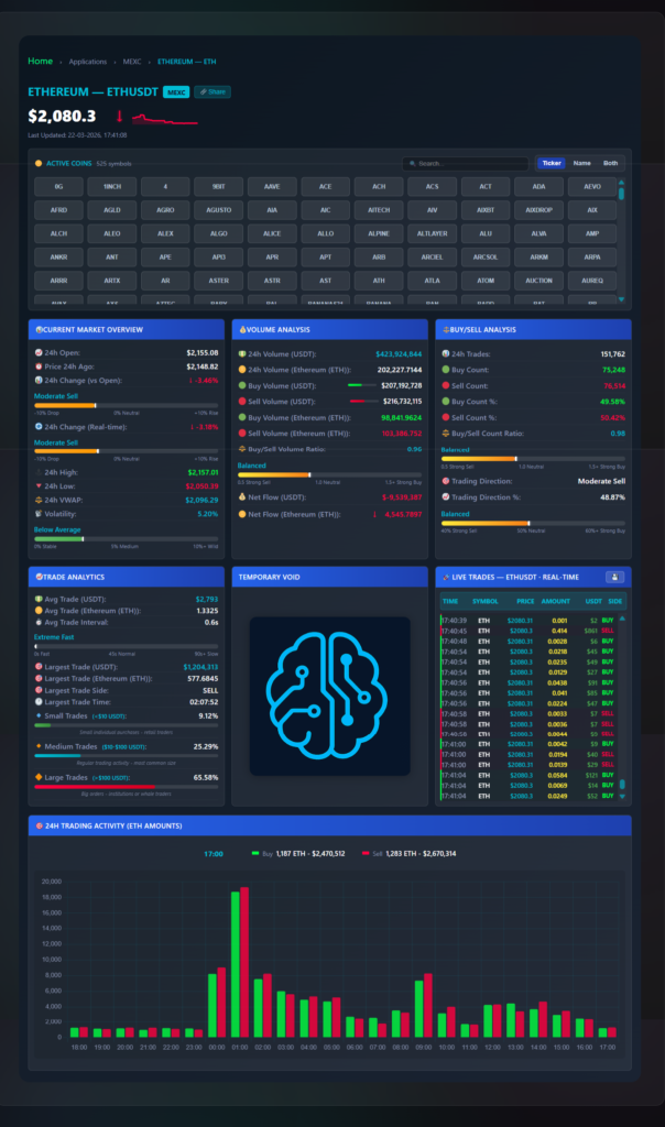
- Trade size segmentation — breaking volume into small (<$10), medium ($10–$100), and large (>$100) buckets. In the ETH example in the screenshot, 65.58% of volume was large trades — that is institutional or algorithmic activity, not retail FOMO. That distinction matters for reading whether a move is sustainable.
- Execution frequency — how fast trades are hitting the tape. The screenshot shows ETH averaging one trade every 0.6 seconds. A sudden drop in execution frequency while price is moving is often the first sign momentum is fading before the price chart shows it.

Market Overview Panel
The top-left panel gives you the current state of the selected coin at a glance, updated in real time from the MEXC WebSocket feed:
- 24h Open and Price 24h Ago — two separate reference points. 24h Open is the price at the start of the current UTC day. Price 24h Ago is a rolling 24-hour lookback. These diverge during high-volatility days and the gap between them tells you whether today’s session is trending or reverting.
- 24h VWAP — Volume-Weighted Average Price for the current 24-hour window. In the ETH example: VWAP is $2,096.29 while current price is $2,080.30 — price is trading below the day’s average execution price, meaning on a VWAP basis the market is in a discount.
- Volatility index — a percentage score (0–10%+) calculated from price standard deviation over recent trades. The screenshot shows “Below Average” at 5.20% for ETH, which means the current session is calmer than typical. High volatility with low net flow is a specific pattern that precedes stop-hunt moves.
- Sentiment gauge — a visual bar positioned between “Strong Sell” and “Strong Buy” based on the composite of buy/sell ratio, net flow direction, and trading direction percentage. Fast to read without interpreting individual numbers.
Volume Analysis Panel
This is the core of the dashboard. All values are running totals for the current 24-hour window:
- Buy Volume vs Sell Volume (USDT) — aggressive buy orders (market buys hitting asks) versus aggressive sell orders (market sells hitting bids). In the ETH example: $207M buy volume versus $216M sell volume — a slight edge to sellers in raw dollar terms.
- Buy/Sell Volume Ratio — 0.96 for ETH in the screenshot, meaning for every $1 of selling pressure there was $0.96 of buying pressure. A ratio below 1.0 is net bearish. Above 1.0 is net bullish. This single number saves having to mentally divide the two volume figures.
- Net Flow (USDT and token) — the delta shown as a signed number. ETH shows -$9,539,387 and -4,545 ETH. Red means net capital outflow. Green means net capital inflow. This is displayed as a coloured bar so the direction is readable at a glance without reading the number.
Buy/Sell Analysis Panel
Volume and trade count often diverge — and that divergence is important. The Buy/Sell Analysis panel tracks the number of individual trades rather than their dollar size:
- 24h Trade Count — 151,762 executions for ETH in the screenshot. This is the raw number of individual fills, not the volume.
- Buy Count vs Sell Count — 75,248 buy-side executions versus 76,514 sell-side. Combined with the volume data: more sell-side executions and more sell-side volume — both metrics agree, which is a cleaner signal than when they diverge.
- Trading Direction — an algorithmic classification (Neutral, Buy, Sell, Strong Buy, Strong Sell) derived from the composite of ratio, count, and flow direction. ETH shows “Moderate Sell” at 48.87% — not strongly directional, which matches the relatively balanced 0.96 ratio.
Trade Analytics Panel — Size Segmentation
This panel is the one that changes how you read volume spikes. Three trade size tiers:
- Small Trades (<$10 USDT) — 9.12% of ETH volume in the screenshot. Typical retail noise and small bot activity. When this percentage spikes suddenly on a low-volume coin it often indicates automated wash trading.
- Medium Trades ($10–$100 USDT) — 25.29%. Standard active retail trading, the largest category by trade count.
- Large Trades (>$100 USDT) — 65.58% of ETH volume. Nearly two-thirds of ETH’s volume came from orders over $100. This is above what you typically see on smaller altcoins where retail dominates. For ETH specifically it reflects the high proportion of algorithmic and institutional activity on the pair.
Additional Trade Analytics data: average trade size ($2,793 for ETH), average trade interval (0.6 seconds — the speed of execution), and the largest single trade captured in the current session ($1,204,313 on the sell side at 02:07:52 in the example).
Live Trades Feed and Data Export
The right column shows every individual execution in real time: timestamp, symbol, price, token amount, USDT value, and side (buy or sell). This is the raw tick tape — the same data the other panels aggregate, but unfiltered so you can watch individual orders land.
The dashboard stores the last 2,000 trades or 6 hours of data in browser memory while the page is open. You can export this as CSV or JSON with one click — timestamp, price, amount, USDT value, and side for every trade. The standard MEXC interface clears trade history and provides no export. For anyone running quantitative analysis, backtesting entry signals, or analyzing spread and slippage behavior on specific pairs, this is the practical reason to use the dashboard over the native interface.
24-Hour Hourly Volume Histogram
The bottom panel shows buy and sell volume broken into hourly bars across the full 24-hour window. Green bars are buy volume, red bars are sell volume, and hovering any bar shows the exact USDT totals for that hour.
The practical use: identifying which hours consistently have the highest volume for a given coin, and spotting intraday patterns. A coin that regularly spikes in the 01:00–03:00 UTC window has a different trading character than one that peaks at 14:00–16:00 UTC. That information is not visible on a standard price chart without manually reviewing candle volume hour by hour.
Practical Use Cases
Reading whether a price move is real or retail-driven
When a coin spikes 5% in a short window, check the Trade Analytics panel. If Small Trades dominate (>50%) and Large Trades are under 20%, the move is retail FOMO with no institutional participation — historically less likely to hold. If Large Trades are above 50% and net flow is strongly positive, that is a different character of move entirely.
Spotting absorption before a reversal
Absorption happens when high sell volume hits the market but price barely moves. The sell side is being absorbed by passive buyers at that level. Watch for high sell volume in the hourly histogram, a sell-heavy buy/sell ratio, but price holding flat or rising slightly — the combination often precedes a reversal upward as the passive buyers clear the supply.
VWAP as a reference for entry
Professional traders use VWAP as a mean-reversion reference. If price is below VWAP and net flow is turning from negative to positive (net flow bar changing from red to green), that combination has historically been one of the higher-probability long entries on liquid pairs. The dashboard shows you both numbers simultaneously, which the native MEXC interface does not.
Exporting data for backtesting
Keep the dashboard open on a coin while monitoring a session. After 2–6 hours, export the tick data as CSV. Import into Python or Excel and analyze actual execution patterns — what percentage of large trades were buy-side in the 30 minutes before major price moves, what the average trade interval was during high-volatility versus low-volatility windows. This kind of analysis is not possible from the standard MEXC interface.
Frequently Asked Questions
Is this an official MEXC tool?
No. This is an independent analytics dashboard built by Logic Encoder that connects to MEXC’s public API and WebSocket feed. It reads data only — it cannot place or cancel orders. It is completely separate from MEXC and not affiliated with or endorsed by MEXC.
Is it free?
Yes, currently free with no subscription required. All features including net flow, trade segmentation, VWAP, and data export are available without registration.
Why does this show different data than TradingView?
TradingView aggregates data across multiple sources and applies its own processing. This dashboard connects directly to the MEXC WebSocket, so it shows the raw MEXC-specific tick data without aggregation. The VWAP on this dashboard is calculated from MEXC trade executions only, not a blended feed.
What does “Net Flow” actually measure?
Net Flow = Total aggressive buy volume (USDT) minus total aggressive sell volume (USDT) for the current 24-hour window. A positive green number means more capital was spent on market buy orders than market sell orders. A negative red number means the reverse. This is different from the buy/sell price ratio — Net Flow measures the actual dollar weight of each side.
Can I use this on mobile?
The dashboard is browser-based and works on mobile, though the multi-panel layout is designed for a wider screen. On a phone the panels stack vertically and remain functional, but a tablet or desktop gives a better view of all panels simultaneously.
→ Open the MEXC Analytics Dashboard — free, no registration, data starts streaming immediately.
Technical overview of the dashboard components: frontend plugin overview and backend overview on GitHub.
Cryptocurrency trading involves significant risk. This tool visualizes public market data for informational purposes only. Not financial advice.
Leave a Reply